Client
Location
#
Branding
#
Typography
A fresh new brand aiming an new position on market.
When a brand's design and storytelling connect through visual and strategic elements.

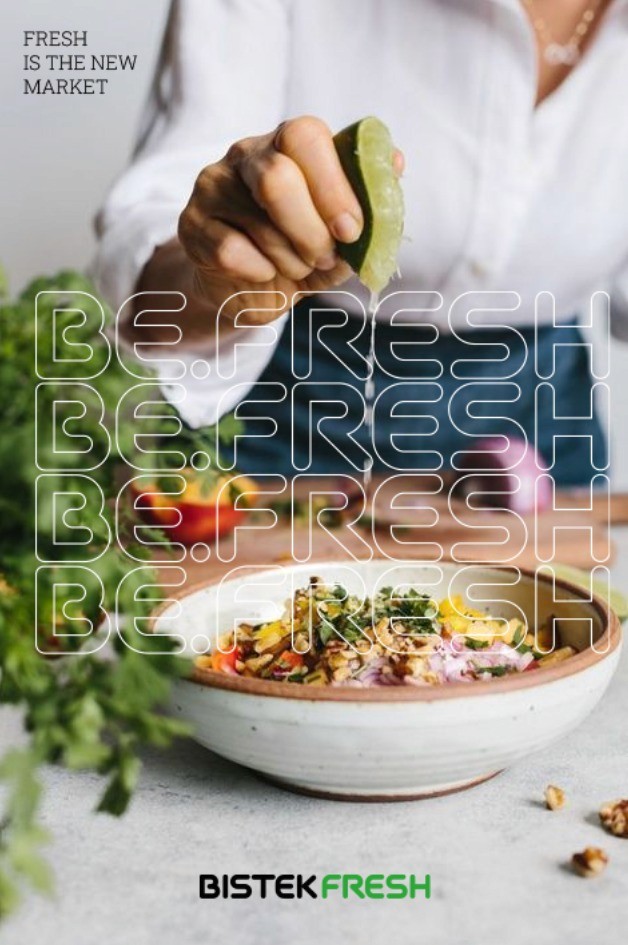
About the project
Bistek Fresh is a brand of the Bistek group, a large supermarket chain in southern Brazil.
Bistek Fresh is a brand of the Bistek group, a large supermarket chain in southern Brazil. It is known for offering quality products at affordable prices. The company was trying to fill a position on the slow food market, bringing a new brand to the game. Betting on an operation focused on fresh food and conscious, sustainable consumption. The project was developed together with the agency Global, under the creative direction of Vini Marques and Jonathan Noel in art direction, as part of the launch campaign.


Challanges
The challenge of the work began with the continuous feedback that the client had been giving the agency they hired. Many options were presented, but none had fully met 100% of the briefing's requirements.
It was then that we sought to understand what had actually achieved the objectives, and based on these ideas, we proceeded with the process, aiming to develop a complete Visual Identity in line with the needs.
Results
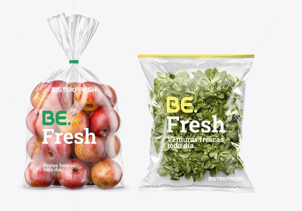
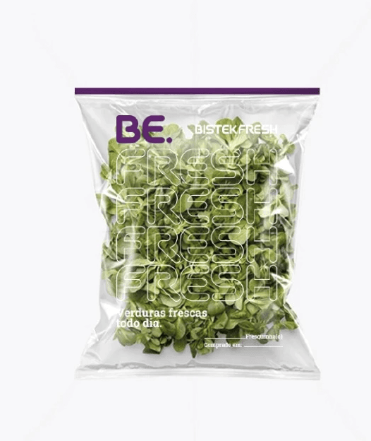
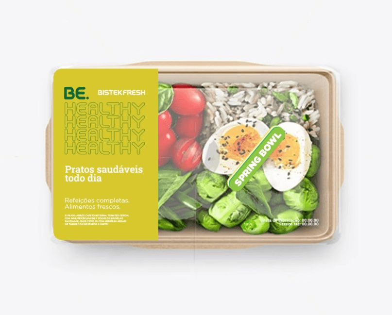
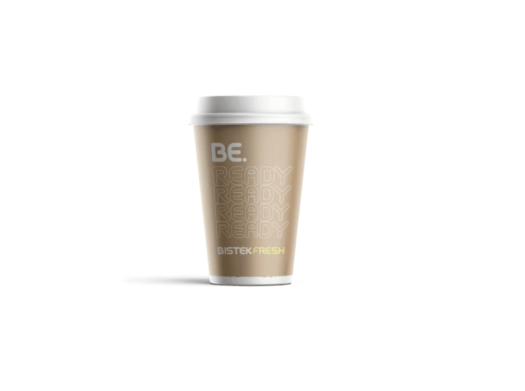
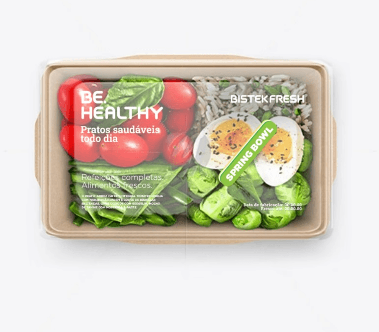
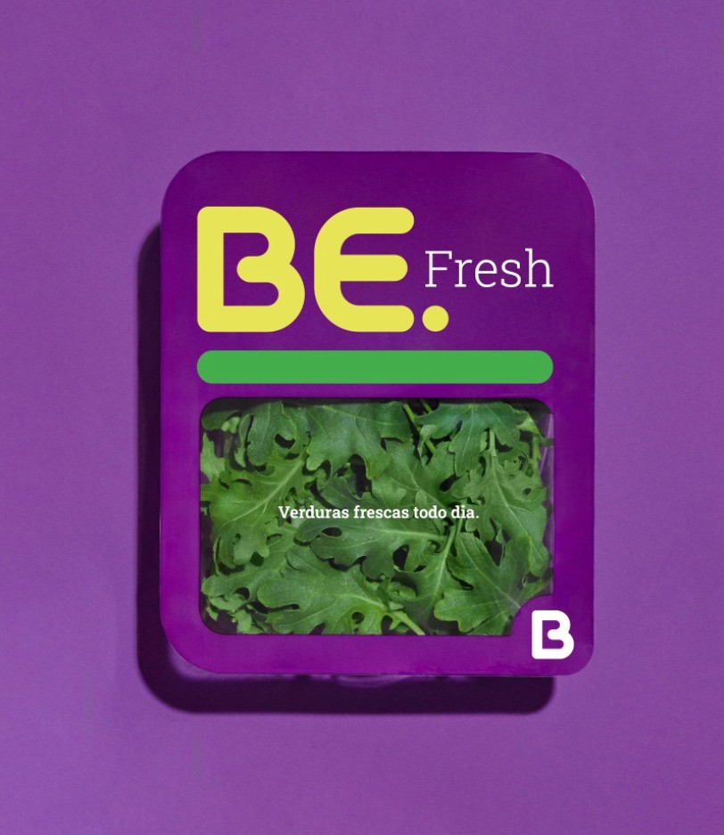
The result was the development of a custom typography for the logo, giving personality to the letter 'B,' which sometimes functions as a shorthand for the brand application.
One of the most relevant points of the work, we believe, goes beyond the visual aspect and graphic coherence. Rather, it is the strategic perspective in relation to the demand. The revisions occurred because previous deliveries were visually rich but lacked explanations, meaning, and usability possibilities. What we did, in addition to understanding the real problem, was to deliver, along with a strong visual project, a solid foundation and real developments for marketing.

Results



Results

DISCOVER MORE